Introduction
Overview
Bay Central Printing shares valuable content on LinkedIn, but I saw an opportunity to enhance its social media presence with a stronger, more engaging visual approach. My goal for this redesign is to create more eye-catching posts that are brand-consistent and optimized for engagement to help them gain more online traction.
By refining typography, layout, and visual hierarchy, I aim to make their posts more shareable and effective in communicating key messages. This case study will showcase the transformation and how strategic design choices can improve audience engagement on LinkedIn.
Old Design
It can feel a bit generic and may not stand out. Without something engaging like a fun design or clever message, it can miss the chance to show off the brand’s personality and encourage interaction.
New DESIGN
I created a Valentine’s Day post featuring a printer with heart paper and a fun printing-themed pun. This playful design is more eye-catching, shareable, and engaging, helping the company connect with its audience. The humor could make the brand feel more approachable while increasing likes, shares, and comments.


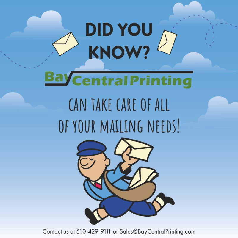
OLD DESIGN
This post promotes Bay Printing Center's ability to handle all mailing needs but doesn’t specify the types of services offered. The background color is too bright, which causes the company logo to get washed out, making it less noticeable. The typography could be improved to better align with the brand’s style.
New DESIGN
By researching the company website, I learned about their mailing services, including bulk mailing, direct mail, and mail marketing. I incorporated these details into the redesign, making the post more informative and specific. I included contact details providing viewers easy access to reach out for more information. This makes the post not only more informative but also actionable, encouraging potential customers to take the next step.